Mobile Apps for Museums — Part 2: Inspiring Lessons & Best Practices from Great Museum Apps
hello@cuseum.com · June 6, 2025
This is the second article in our three-part series exploring how mobile apps are reshaping the museum experience. If you haven’t read Part 1—*Why Museum Apps Matter *—we recommend starting there. And stay tuned for Part 3, where we dive into trends and strategies to help you build the museum app of tomorrow.
More and more museums are discovering what works best in the world of digital tools, engagement software, mobile apps. Today, we’re not writing about hypothetical recommendations – we’re talking about real institutions with real apps that are helping their audience get more out of their visits, enjoy the experience on their terms, and feel a little more connected to the museums they love.
When done right, museum apps don’t feel like “tech.” They feel like part of the museum itself—an invisible thread between objects, stories, architecture, and audience.
Let’s explore what makes these apps useful, delightful, and yes, occasionally magical.
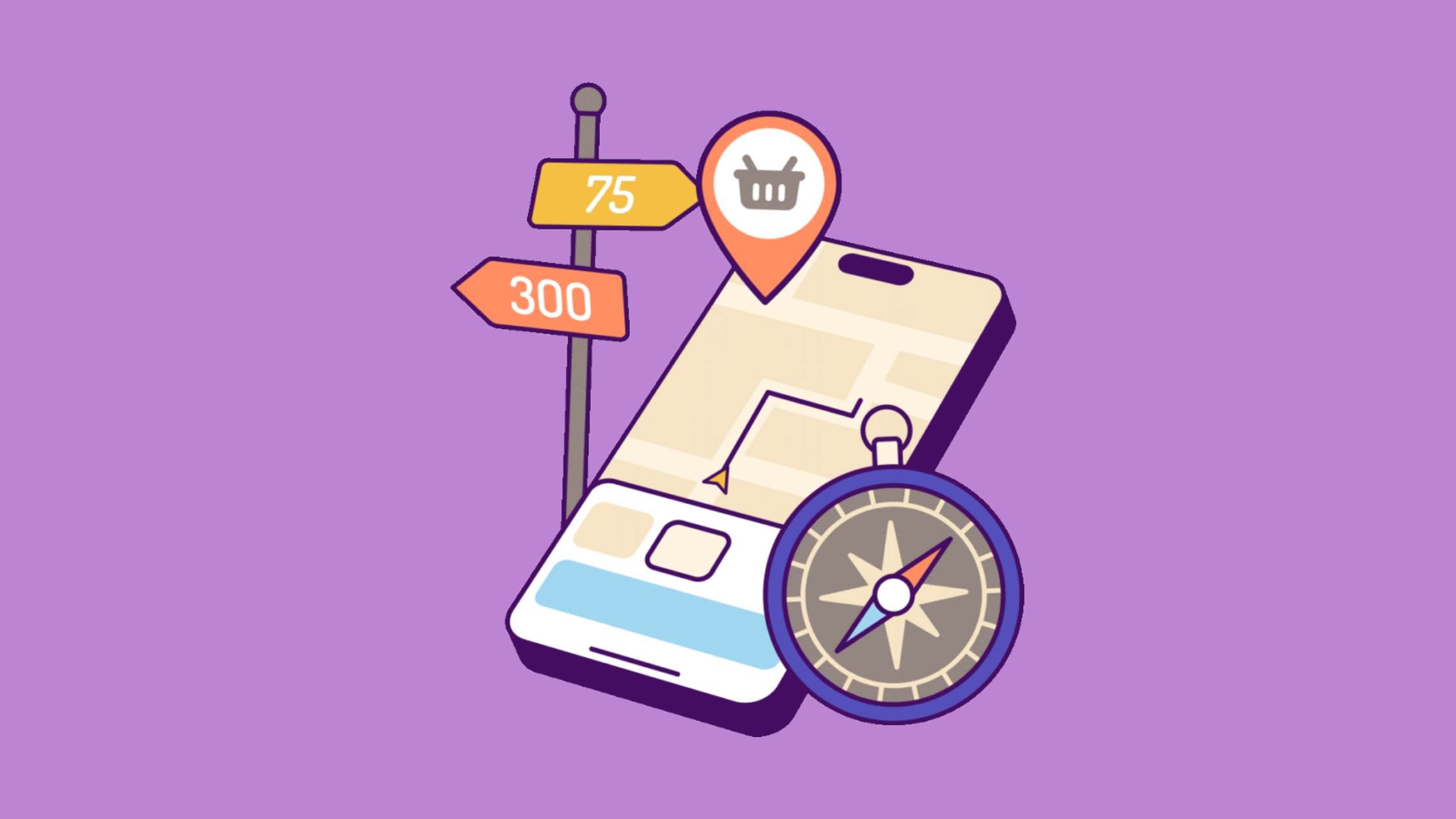
What Makes a Museum App Most Useful?
There are a few patterns worth noticing in the apps that visitors enjoy using most. The most effective mobile experiences aren’t overloaded with features. They don’t try to be everything at once. And they don’t force you to learn an entirely new interface to find the information you need.
Instead, they prioritize a few key things:
They make the visit easier, not more complicated.
They connect to what visitors care about, whether that’s the art, the stories, or just finding the bathroom or cafe.
They do something better than the alternatives—whether it’s faster than printed maps or more dynamic than clunky ol’ audioguides.
And let’s be honest—if someone can book a flight, buy socks, and track a pizza delivery from their smartphone, they’re not going to be pleased by an app that takes 15 minutes to download or crashes while loading the exhibit map.
Let’s look at how two institutions—The National Museum of the United States Airforce and The Edgar Allan Poe House & Museum, and how they got this right.
Case Study 1: National Museum of the United States Air Force Foundation
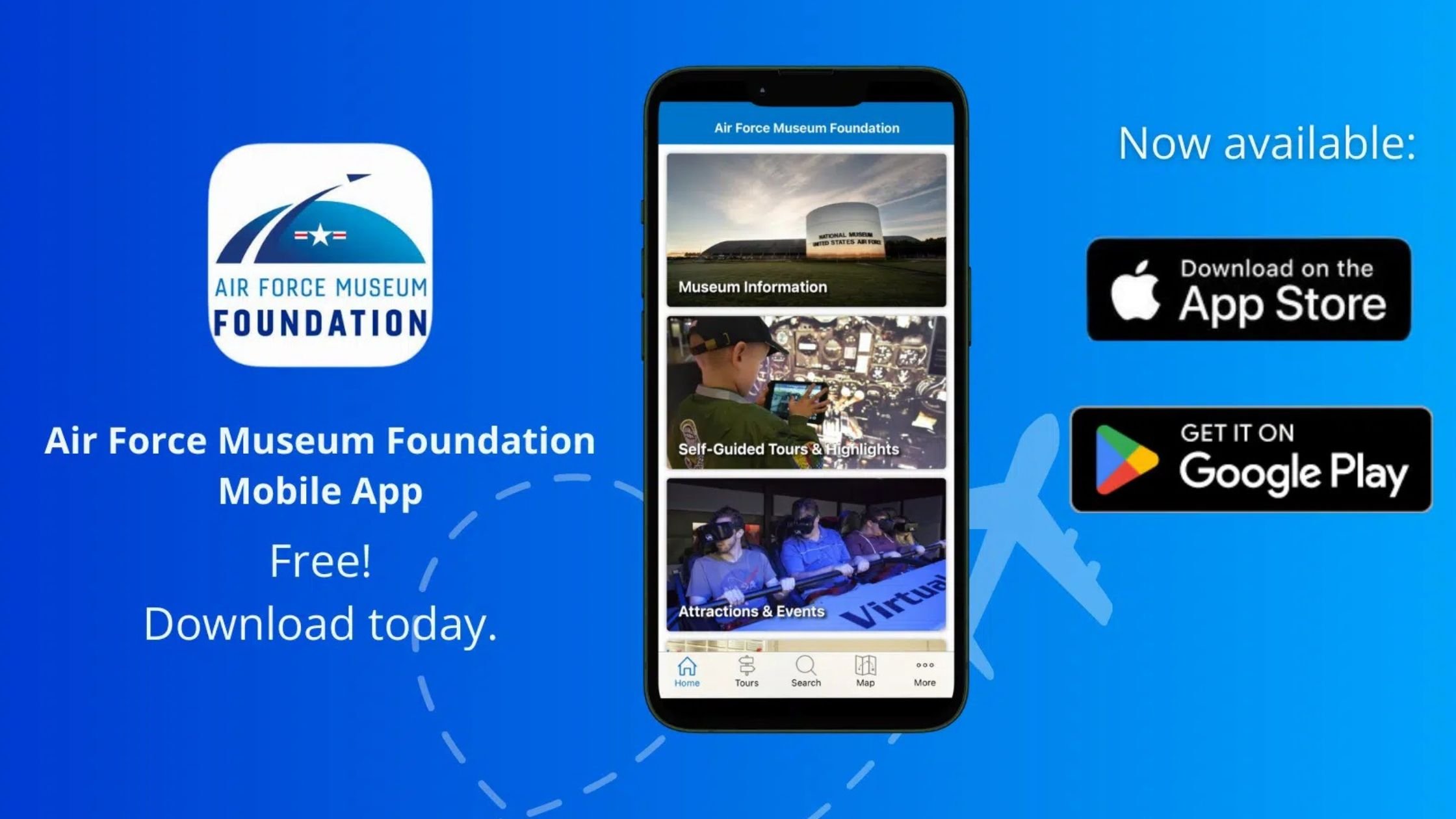
Air Force Museum Foundation’s app for The National Museum of the United States Air Force offers a standout example of how interactive mapping, scavenger hunts, and some AI-powered accessibility elements can elevate a visit. Their app provides detailed, multi-level maps of the museum’s vast hangars and exhibition spaces; each one layered with clickable information about aircraft, artifacts, and flight-related exhibits.
Visitors can tap through jet engines, learning at their own pace without ever needing to flag down a docent. The interface is built to support not only exploration but orientation—especially helpful in a venue where scale is part of the experience.
Beyond just wayfinding, the app turns every corner of the museum into a launchpad for learning. Whether you're a first-time visitor or a lifelong aviation enthusiast, the app gives context to what you're seeing without pulling you away from the actual aircraft.
What it gets right:
Combines navigation and interpretation into one cohesive experience.
Empowers visitors to dive deep into military aviation history on their own terms.
Offers several self-guided tours such as scavenger hunts, a half-day tour, and a full-day tour.
Makes an expansive and technical collection accessible to people of different backgrounds and languages (English, German, French, Spanish, Chinese, Russian, Arabic, Vietnamese, Korean, and more!).
It’s the kind of app that turns “Wow, that’s a big plane” into “Here’s why this plane mattered—and here’s what it could do.” It’s also the kind of app that leaves visitors more satisfied.
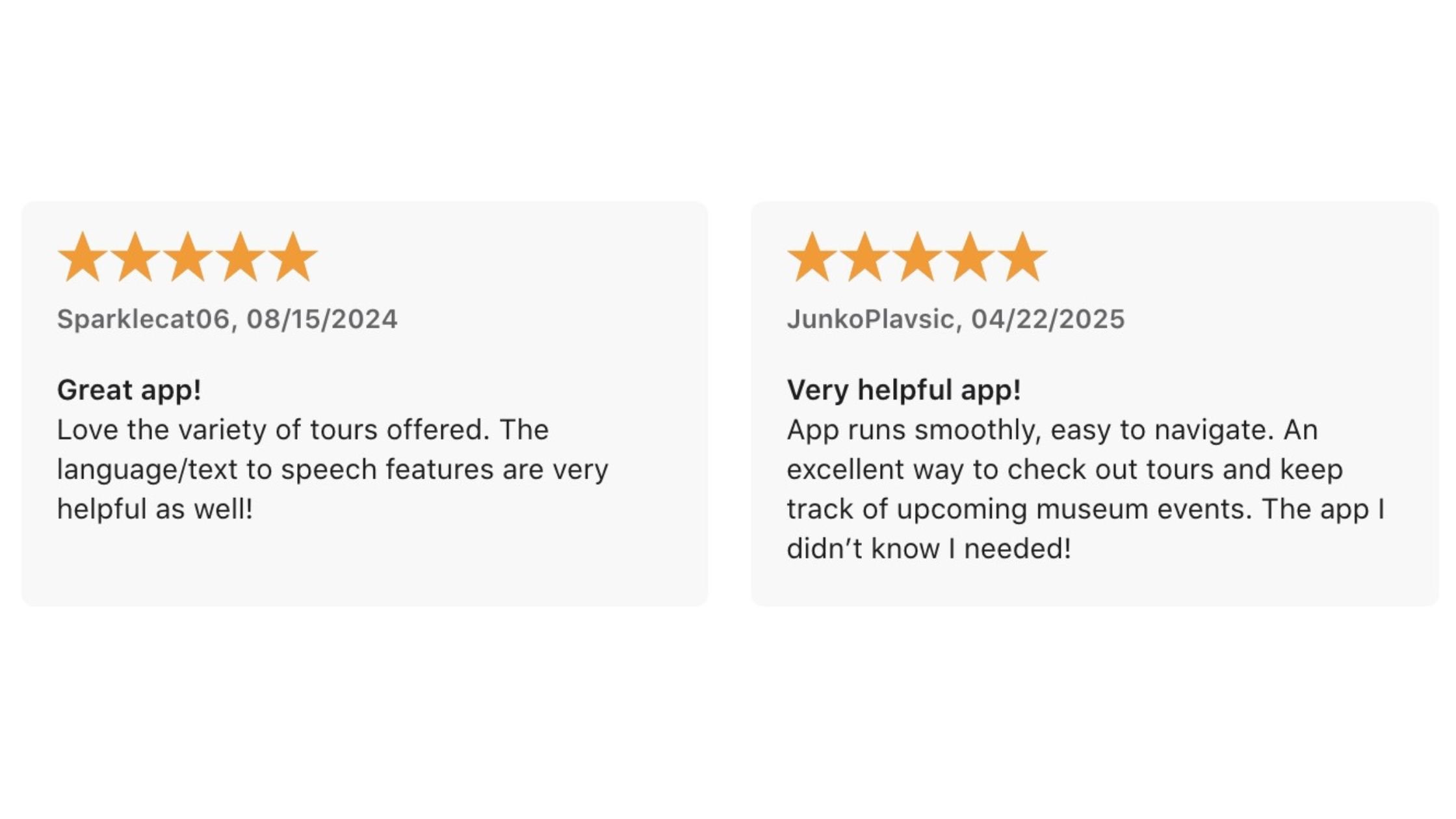
It’s no wonder why this app is rated 5 out of 5 on the Apple Store and emphasizes the importance of focusing on features that benefit your visitors.
This app makes you feel like you’re charting a course through aviation history. It doesn’t shout for attention or flood you with features. Instead, it quietly hands you the controls: here’s where you are, here’s why it matters, and here’s what’s hiding just around the corner. No museum map could’ve done that.
No pamphlet would’ve made you linger at a missile bay. This is tech doing what it should—getting out of the way, and making the experience feel bigger, not smaller.
Case Study 2: The Poe Museum
The Poe Museum’s app, powered by Cuseum, is a masterclass in thematic storytelling. Visitors can explore exhibits through curated journeys centered around Edgar Allen Poe’s works and life events. It offers audio narration, contextual information, and even allows users to select specific objects in each room to learn more about their significance.
This app doesn’t just tell you what you’re looking at—it invites you to sink into the eerie, chaotic, and occasionally morbid world Poe built with his writing. It connects the dots between his fiction and the artifacts on display, turning a walk through the museum into a fully immersive narrative.
What it gets right:
It builds a narrative structure instead of dumping raw facts.
It doesn’t overwhelm the visitor—it guides them.
It provides engagement before and after the visit, not just during.
It’s like getting a tour from Poe himself—minus the brooding stares and Victorian melancholy.

Things to Avoid when Designing a Museum App
If there is anything to take from these two case studies is that their apps were not bloated and focused on the needs and interests of their audience. Their benefits and functions were specific, easy to understand, and easy to make use of..
Here are 4 traps that are easy to dodge:
Clunky UX that is cumbersome or feels like homework
Poor maintenance (outdated content, broken links)
No feedback loop—no way for users to say what’s working or not
When your app becomes a museum of broken buttons or potentially overwhelms the visitor, it’s time to rethink things. Go back to the basics and define a clear objective that aligns with your organization’s mission and values.
Cuseum’s Recommendation
A great museum understands the visitor and meets them where they are. When technology helps support curiosity, aligns with your educational objectives, and positively impacts your visitor’s experience, you’ve got something more valuable than the sum of all its parts.
Ready to offer a mobile app that your visitors love? Let’s chat!