
What Google Wallet's New Design Means for Membership Cards
Cuseum · November 10, 2026
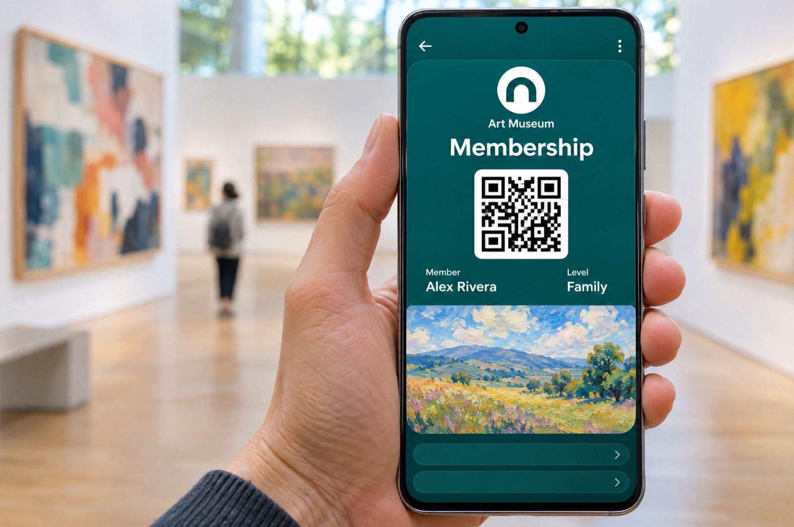
Until this year, a membership card in Google Wallet on Android looked much like a card from a coffee shop. A small round logo and the program name sat in a header row, the member's details came next, a barcode sat near the bottom, and a wide banner image ran across the body. It worked at the door. It did little to show members what they had joined.
In 2026, Google changed that in two steps. In April it redesigned the Wallet app itself for quick access and search. Then, in September 2026, Google introduced what it calls Android Expressive Passes: new layouts for event tickets, boarding passes, loyalty cards and generic passes, with bolder branding, larger hero images and refined details views.
Android matters for membership programs. StatCounter's October 2026 figures put Android at 48% of mobile web traffic in the United States, so close to half of your members may see the new look.
Here is what Google changed, what to review on your own card, and what to expect in the future.
What Google Changed in 2026
Google announced the Google Wallet redesign in April 2026, built for quick access, search and discovery. At Google I/O in May 2026, it said the new interface was now available, with favorites on the home screen and a "View more" section where members can search every pass they hold.
The pass layout followed. The new Google Wallet card puts a round logo at the center of the top, with the program name under it. A full width title comes next, then the barcode in the middle, one or two rows of data fields, and a hero image across the bottom, with the details section below. The earlier layout put the logo at the top left, the barcode at the bottom and details behind a separate button.
One difference from Apple matters here. Apple's poster style is a new pass style that issuers have to build. Google's new layout is drawn from fields issuers already send: the logo, the background color, the barcode, the card rows and the hero image.
Rethink Your Hero Image, Logo, & Color
The biggest visual change is the image. Google's brand guidelines now describe the hero image as a full width image under the data fields, recommended at 1032 by 812 pixels, close to 5:4. Until the spring, the same guidelines described a wide banner, 1032 by 336 pixels, three times wider than tall. Google says to avoid text inside the image, because it will not be translated, and to keep main content away from the top and bottom edges. If a pass has no image, Google Wallet shows a fallback image for the pass category.
For museums, zoos, aquariums and gardens, the new shape gives a painting, an animal or a garden more room. It also means banners made for the old wide frame were designed for a different space. If your card still uses one, check how it looks in the new layout.
Cuseum cards take this image from your card template, so the image you choose there is the one members see. Crop it to the frame you want before you add it, rather than relying on the phone to do it.
The logo and color deserve a look at the same time. Google Wallet masks the logo into a circle, so it asks for a square PNG of at least 660 pixels, with a margin of about 15%, and says not to mask it first. A wide, rectangular logo is likely to be cut badly by a circle. On color, Google Wallet lets issuers set a background color and recommends a short list, from dark gray and off white to blue and green, while advising against very bright neon shades. Cuseum cards use the background color set in your template.
A few questions to work through with your team:
- Which images do you have the rights to use on members' phones?
- Which ones still work at card size, with no words inside them?
- Is your logo square, and does it still read inside a circle?
Put the Right Links Under the Card
The second feature is about action. Google Wallet lets issuers add modules to a pass, each with a header, a short body, an image and a link to a web page or an app. Google calls them value added opportunities, and it advises clear wording, related imagery and showing only what is active. Modules sit in the lower section of the pass, and a pass with a single module shows it on the front.
Unlike Apple, which offers two featured actions with labels it sets, Google lets you write your own words. Google displays up to fifteen modules on a pass.
Cuseum customers have had this since 2025, when Cuseum brought a Member Perks module to Google Wallet cards. Member Perks are built on these Google modules, and Cuseum sets no limit on how many a card can have. Where they sit in the new layout is up to Google, so the best advice is to put the most important one first.
Decide which pages you want members to reach in one tap, and make sure each one works well on a phone.
Plan Notifications That Arrive at the Right Moment
Google Wallet's support for notifications already suits membership. An issuer can add a message to the back of a pass and send a push that opens it, up to three per pass in a day. Loyalty passes can also notify when a field changes, such as a points balance. Nearby notifications can alert members near a location, with up to ten locations per class and per pass, and Google decides when to show them and controls the text.
Google's guidelines now also limit notification text: a title under 29 characters, a collapsed body under 40 and an expanded body under 80. At I/O, Google also said it plans customizable push notifications and locations inferred from Maps for some loyalty passes.
Cuseum sends each notification as a message on the card, with a push to the member's phone. A link in the message is also added to the card, and each pass can receive up to three notifications a day. Ordinary pass updates refresh the card without alerting the member, unless Google Wallet itself alerts for that change.
Google's own case studies show what well timed messages can do: San Francisco Zoo & Gardens, working with Cuseum, saw member interactions up 400% and a 75% open rate on its push notifications. The useful work now is planning the messages: a welcome for new members, a reminder before a members' preview, a nudge as renewal approaches. A few well timed notifications will serve members better than frequent ones.
Expect Two Looks for a While
Google calls the new design Android Expressive Passes, so it is aimed at Android. Google's own examples still show the earlier layout for the web view at wallet.google.com, so members who open a card in a browser may see a different design.
That means front desk staff can expect to see a few versions for a while: the new Google Wallet card, the web view, and Apple's two styles. The barcode stays prominent in both Android layouts.
If your site or emails invite members to add their card, use Google's current "Add to Google Wallet" badge. Google refreshed the badge assets in September 2026.
Apple and Google Now Both Lead With the Image
In 2026, both wallets moved toward cards led by larger graphics and artwork. Apple introduced its poster style in iOS 27, and Google introduced Expressive Passes on Android. The two do not match in the details:
- Apple's poster style needs iOS 27 and keeps a standard card as a fallback. Google redraws Google Wallet passes from fields they already have.
- Apple allows two featured actions with labels set by action type. Google Wallet allows several modules with your own wording.
- Apple publishes no size rules for poster artwork. Google publishes 1032 by 812 pixels.
Plan your content so the best image and the most important links work on both wallets. Google also features a membership program built with Cuseum in its success stories, and Cuseum's work with Google Wallet helps museums make digital membership cards part of the mobile wallet experience their members already use.
Where Cuseum's Support Stands
Teams that want to start planning their images, links and messages can talk to their Cuseum contact. The early work is the same whatever comes next: images you can use, pages worth linking to and messages worth sending.
Design the Card for Both Wallets
The wallet card is no longer only proof of membership. Both Apple and Google now give it room to remind members why they joined with visually compelling imagery.
Pick an image that works in the taller frame. Check your logo inside a circle. Choose a calm background color. Keep titles and labels short. Decide which links sit under the card. Write the notifications you will want to send.
Ready to Get More From Your Membership Cards?
Cuseum helps museums, zoos, gardens and cultural organizations deliver digital membership cards in Apple Wallet and Google Wallet, connected to the CRM, membership and ticketing systems they already use.
Request a demo to see how it works.