Boosting Membership & Donations Through Your Mobile App
hello@cuseum.com · April 3, 2017
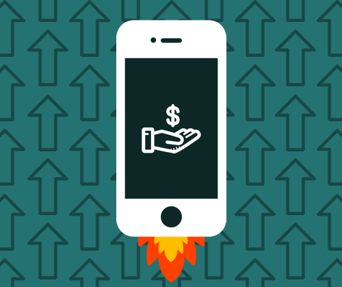
A sure-fire way to drive more memberships and donations is to ensure the process is quick and easy for your visitor. It is crucial to break down the barriers between the visitor’s intent to support your organization and the checkout process. This is often easier said than done…
Early on, we found that museums that link out to their website’s membership sign-up page weren’t getting any traction, so we built a tool specifically to this fix. In addition to addressing this issue, our primary driver behind developing a membership and donation tool is to provide a visitor-first, quick, and easy process.
Why is this so important? Let’s look at some concrete data to find out.
Slow Transactions = Lost Revenue.
Even a mere 2-second delay in load time during a transaction will result in abandonment rates of up to 87%! When you link out to a webpage, it (unfortunately) take several seconds to load everything, and even longer if your user’s connectivity and your website are anything other than lightning fast.
44% of online shoppers say that slow online transactions make them anxious about the success of a transaction. Do you want your visitor to feel anxiety while they’re signing up to be a member of your museum? Probably not.
Compare this to our native membership tool, which is… instant. Your visitors don’t need to leave the app or wait for a webpage to load. Problem solved!
Don’t force your user to create a new user account.
Have you tried to purchase something online and were forced to sign-up for yet another user account? You were hoping for a few clicks, check-out, and done… but you were required to create a new account and fill out another 10 fields. Ugh! There is even a decent chance you completely changed your mind due to the added time and burden.
When dealing with membership sign-ups, requiring your prospective member to register for a new user account is not only an inconvenience for them, but this requirement is actually detrimental to your organization’s efforts to attract members and donors. 23% of users would abandon cart because they had to create a new user account. Ouch!
With our membership tool, your visitor will be happy that they only needed to enter a few fields of information, tap, and they’re done. In the words of Staples (you know what’s coming): “that was easy.”
Keep it simple
As passionate museum-goers, non-profit supporters, and partners, we’ve seen tons of donation and membership forms over the years. Asking for too much information, or using non-traditional layouts can result in a confusing experience for your user.
If your checkout process is not optimized for mobile devices, that awkwardly scaled-down web page might be confusing for some users. And this isn’t ideal for anyone because 12% of users would abandon cart because the checkout process is confusing.
Call to Action!
Wouldn’t it be great if you could control the exact moment in your visitor’s journey when you solicit them to become a member or make a donation? Wouldn’t that be magical?! Well, we’re happy to tell you that it’s possible and easy to implement!With the help of beacons, you can trigger a notification to appear on your visitor’s phone right as they complete a tour or walk towards a specific location. As your future members or donor heads for the exit, take hold of the opportunity to thank them for visiting, remind them of the perks of becoming a member, and invite them to support your institution.
Ready for the knockout punch? When people are delivered a message that is based on their context and location, their intent to transact increases by up to a whooping 20 times!
When you marry great technology with philanthropy, the outcome is grand.
Ready to kick it up a notch?
These tools are all available and ready for the taking. Interested in boosting membership and donations through your mobile app?