Over the years, we’ve downloaded just about every mobile app that’s been released in the museum sector. We’ve witnessed some amazing, clean, and simple ones. We have also seen many… well, let’s just say “bloated” apps.
Before writing a single line of code, we spoke to museums and visitors around the country to understand the needs, challenges, dreams, and opportunities. Like a #musetech sponge, we soaked up every anecdote and statistic we encountered. Focusing on one aspect in particular, we often heard stories about lower than expected download rates… only to find out that the apps in question were some of the largest apps we’ve seen.
Let’s talk about size
The file size of your app isn’t a sexy topic, but it’s a conversation we need to have since it has major implications on your app’s download rates. Years back, if your iPhone app file size was over a mere 20MB, it would require a Wi-Fi connection in order to download. As you can imagine, this factor alone would immediately cut into download rates because it creates an obstacle and barrier for visitors who would have potentially downloaded the app.
Apple later loosened the requirement and increased the ceiling to 25MB, then to 50MB, and finally to 100MB. With a ceiling in place from the start, Apple reinforced the importance of thoughtful attention to user experience: make it quick and easy for users to download apps… without changing their behavior or forcing them to make sacrifices.
There are very few instances when a mobile app needs to be over 100MB. For instance, games with detailed 3D graphics and high fidelity sound are often the largest apps on the App Store. But, with museum apps, this isn’t and shouldn’t be the case.
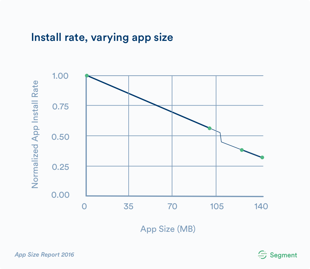
In October 2016, Segment published their findings and estimated a linear decrease in install conversation rates of 0.45% per MB. Apps that weighed in at over 99.9MB in download size would face an estimated 10% drop in install rate, as they cross the 100MB download limit.
The dreaded content “package”
Put yourself in the shoes of your visitor: you’ve just downloaded an app (yay!), and 5 seconds in… the bomb drops: you’re now required to download an extra “package” of content at a whopping 100MB! Your energies were high as you anticipated the seamless, content-rich experience that awaited you, but instead you have to wait… and hope you have space on your phone for all that extra baggage. We’ve all been there.
The temptation of Augmented Reality
There has a been a great uptick in interest around augmented reality (AR) within the cultural sector. Although still in the early days, many institutions are rushing to experiment with the way new perspectives and experiences can be created and delivered.
But, let’s not forget: AR comes with file size baggage… often to the tune of over 100MB, 200MB, even 300MB in file size.
Are you confident that your visitor will want to download a 250MB app on their phone?
Having more features and high definition content may sound tempting, but take a moment to consider your goals, and your visitor’s appetite and patience. While having an AR-driven experience might sound cool (as many shiny new objects are), the 100MB+ app that houses the experience may very well deter visitors from downloading it to their devices.
Small & simple wins the race
Whether or not Cuseum is the partner driving and powering your institution’s mobile app, we believe that sharing best practices is one of the things that helps make any community thrive. We know there are many different approaches to building mobile experiences for visitors, and hope that more museums will “trim the fat“ from their apps as a means of removing barriers between themselves and the visitors they’re dedicating to serving.


